The ugly beauty of graphic design
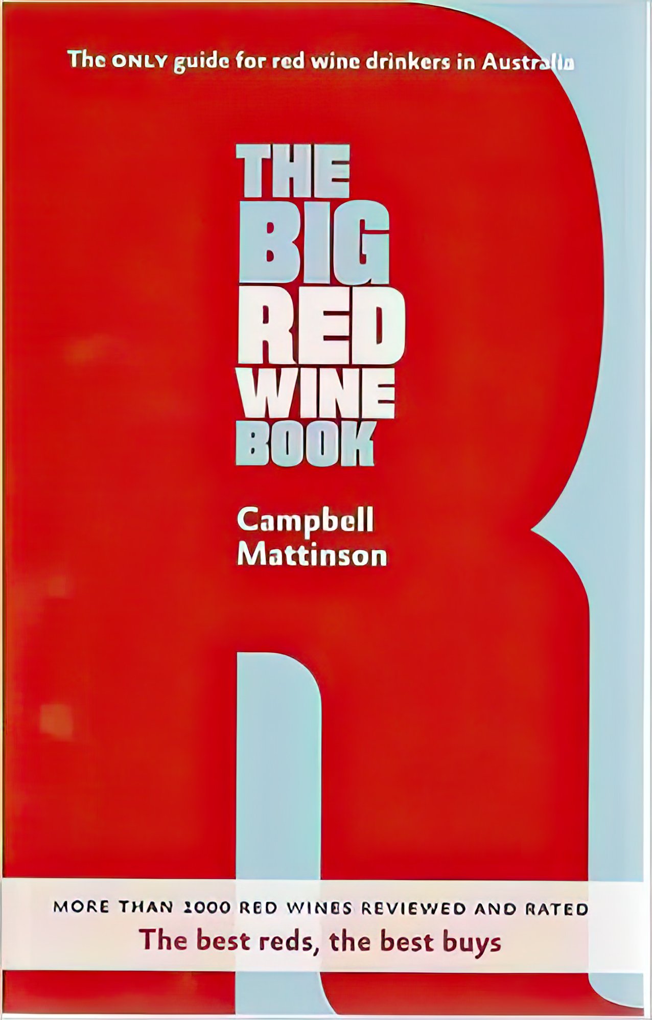
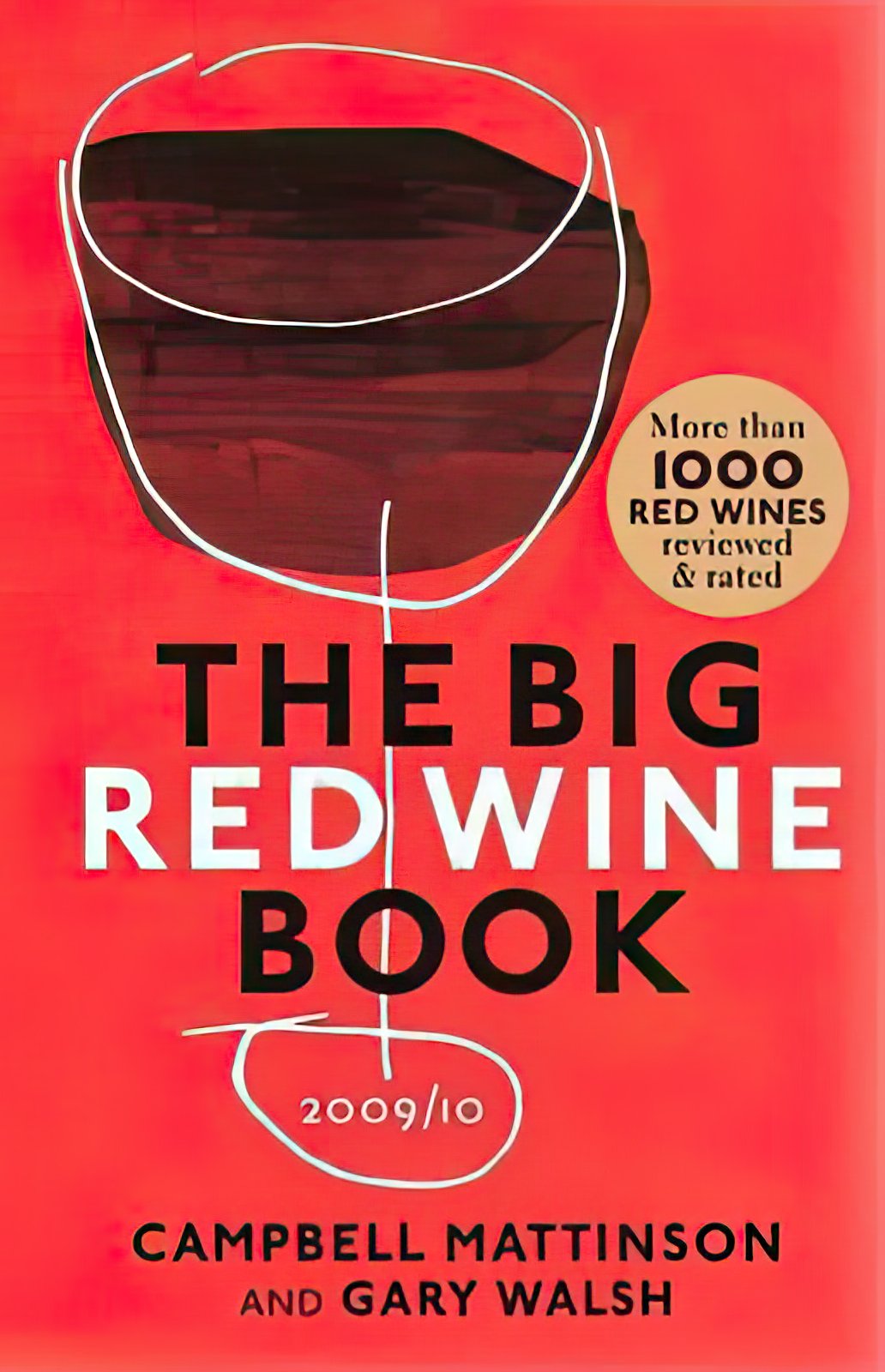
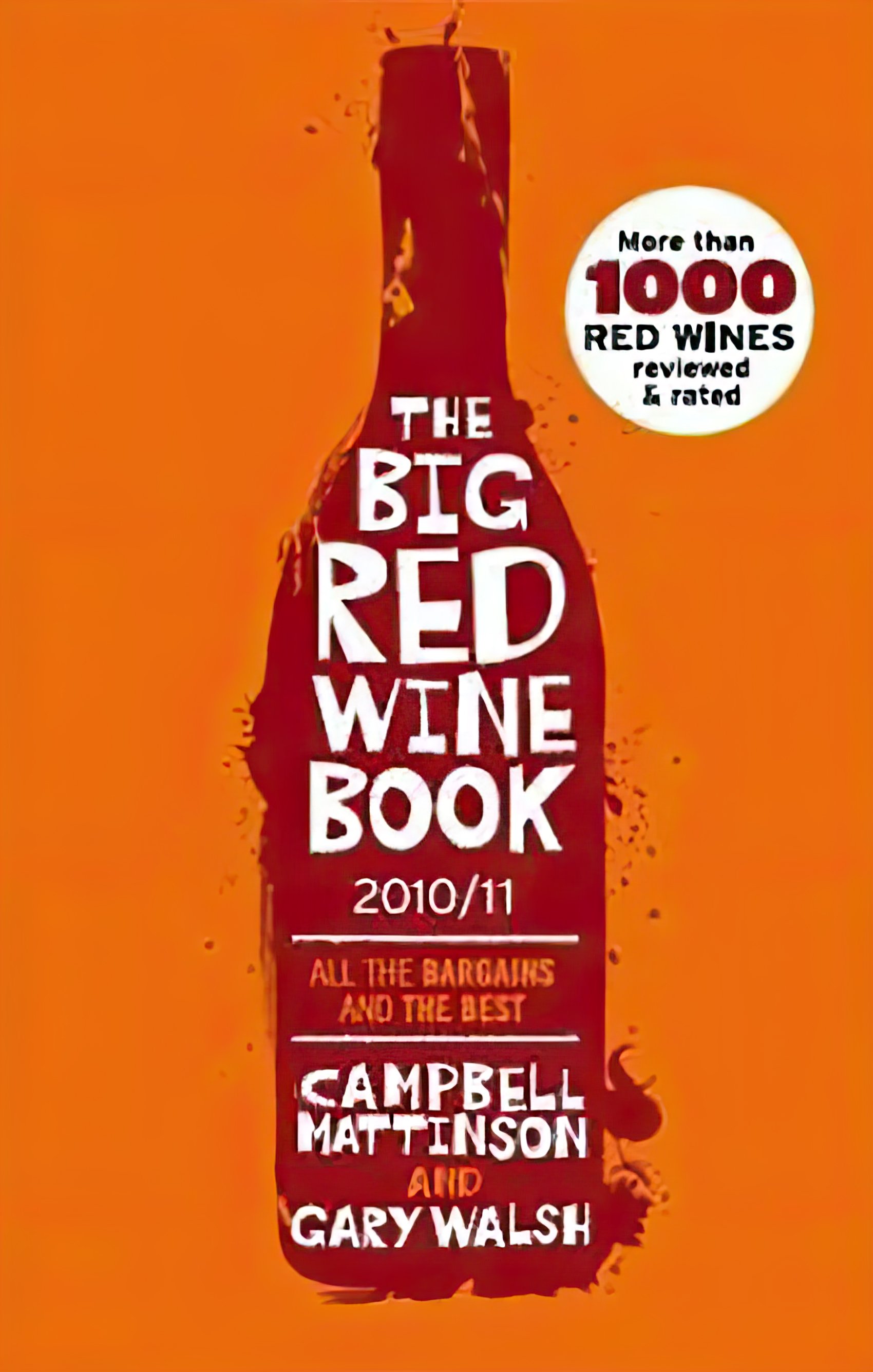
None of these designs are my work obviously - I’m not a graphic designer - but because these were my books, I was always a bit too close to them to have a proper view on their cover designs. I never liked the colour choices of the first two, despite it being a ‘Big Red Wine Book’, though I recall really quite liking the orange design on the 2010/2011 edition. Time offers perspective. I’m not sure that any of them have aged well though my views on the first one - with the big R - which was by far my least favourite back then, have changed a bit. I can now see what the designer was going for there. I still don’t like it. But I can see that it was an attempt to break the mould, which I respect. The orange one is highly derivative but it works.
Campbell Mattinson writes for The Winefront.